five CSS3 Techniques For Major Browsers using the Power of jQuery
Many exciting new functions and features are being thought up for CSS3: text-shadow, box-sizing, opacity, multiple backgrounds, border-radius, border-image, etc…
1. Border Radius: Create rounded corners
W3C has offered a very interesting option for borders in CSS3, of which one is border-radius. This CSS3 styling rule allows rounded corners to be set. Both Mozila/Firefox and Safari 3 have implemented this function, which allows you to create round corners on box-items.
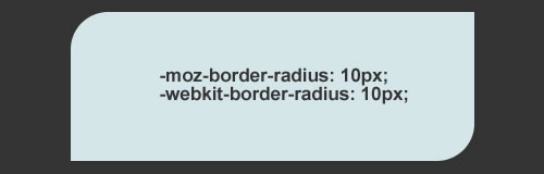
Use the followig css code to replicate the above example.
- #rounded-box {
- -moz-border-radius-topleft: 15px;
- -moz-border-radius-topright: 0px;
- -moz-border-radius-bottomright: 15px;
- -moz-border-radius-bottomleft: 0px;
- -webkit-border-top–left-radius: 15px;
- -webkit-border-top–rightright-radius: 0px;
- -webkit-border-bottom–left-radius: 0px;
- -webkit-border-bottom–rightright-radius: 15px;
- }
Below you will find jQuery solutions and plugins that will allow you to create rounded corners without using images.
How To » jQuery Canvas Rounded Corners
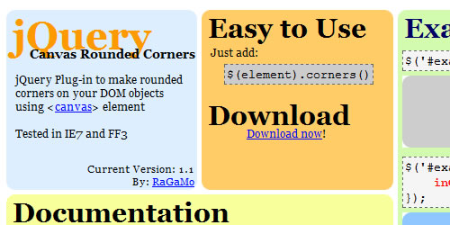
jQuery Plug-in to make rounded corners on your DOM objects using <canvas> element. Tested in IE7 and FF3
You can change the following Options:
- radio – (int) radius size of corners
- inColor – (color) inside color of element
- outColor – (color) outside color of corners
- borderSize – (int) border width
- borderColor – (color) color of borders
How To » jQuery Corners
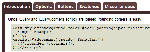
This jQuery plugin will easily create beautifully rounded corners. No images or obtrusive markup necessary.
2. Border Image
Another exciting new border feature of CSS3 is the property border-image. Border-image, allows an image to be used as the border of an element. Each side of the image corresponds to a side of the HTML object.
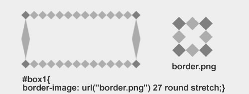
Currently “Border Image” is only implemented in the upcoming Firefox3.1 and recent releases of Safari and Chrome. Below you will find a tricky jQuery solution that will allow you to have this feature work in: Firefox 2.*, Firefox 3, Firefox 3.1, Safari 3.*, Chrome 1.0, Opera 9.*, Opera 10
and IE7.
How To » jquery.borderImage.js
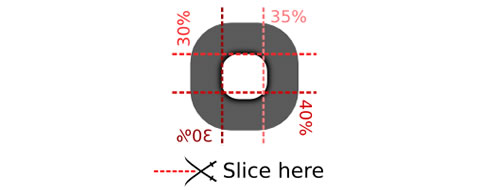
jquery.borderImage is a cross-browser, partial implementation of CSS3’s border-image property. This plugin can create the same effect as border-image by creating nine slices from the image one by one, and then tile them in the background of our element.
3. Multiple Backgrounds
CSS3 allows for multiple background images on one element, this is a real time saver. To do this, you can separate backgrounds by commas, like this
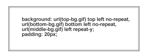
- #multiple-background-box {
- background: url(top-bg.gif) top left no-repeat,
- url(bottombottom-bg.gif) bottombottom left no-repeat,
- url(middle-bg.gif) left repeat-y;
- padding: 20px;
- }
Since this features is not supported by most browsers yet, and you want multiple/layered backgrounds for a div tag, you would nest div tags inside of each other with the CSS to give it the background you wanted. That’s a lot of code, and doesn’t seem too effecient. The solution is to use jQuery with the Background Layers plugin.
How To » CSS Multiple Backgrounds / Background Layering with jQuery
The Background Layers plugin reduces the amount XHTML you need to write simply by adding a few lines of JavaScript, making your code much less cumbersome. The concept is similar to the use of layers in Photoshop, one background image on top of another.
- <script type=“text/javascript” src=“/includes/jquery.background_layers.js”></script>
- <script type=“text/javascript”>
- $(function(){
- $(‘.marioBox’).add_layer(“#A4D3FF”);
- $(‘.marioBox’).add_layer(“url(‘/images/mario_floor.gif’) no-repeat bottom”);
- $(‘.marioBox’).add_layer(“url(‘/images/mario_bush.gif’) no-repeat 10px 167px”);
- $(‘.marioBox’).add_layer(“url(‘/images/mario_pipe.gif’) no-repeat 180px 183px”);
- $(‘.marioBox’).add_layer(“url(‘/images/mario_cloud.gif’) no-repeat 90px 93px”);
- $(‘.marioBox’).add_layer(“url(‘/images/mario_cloud.gif’) no-repeat 180px 53px”);
- $(‘.marioBox’).add_layer(“url(‘/images/mario_cloud.gif’) no-repeat 20px 73px”);
- $(‘.marioBox’).add_layer(“url(‘/images/goomba.gif’) no-repeat 70px 214px”);
- $(‘.marioBox’).add_layer(“url(‘/images/mario.gif’) no-repeat 180px 156px”);
- });
- </script>
- <div class=“marioBox” style=“height: 248px; width: 248px;”></div>

The code above demonstrate laying backgrounds than to use a few sprites from the classic video game, Super Mario Bros 3.
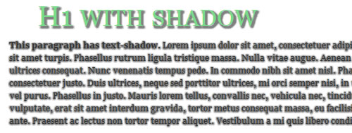
4. Box Shadow and Text Shadow
The main goal of this property is to give designers and css coders a nice way to display a shadow behind your text. The property syntax should look like this:
- h3 { text-shadow: 2px 2px 2px #333; }
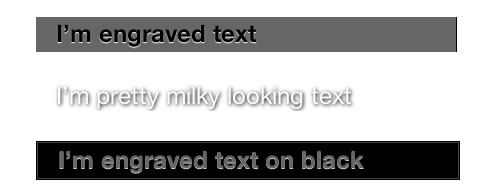
A very useful article i found at Kretschmann’s website, explaing different usage of this property and including different example for using it in a nice way.
Again, this property is not supported by Firefox and IE, so we have to find ourself another way of doing it using jQuery.
How To » Drop Shadow
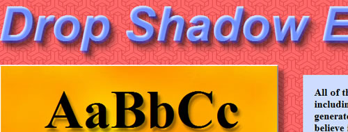
This plugin creates soft drop shadows behind page elements, including text and transparent images. It accepts options for the horizontal and vertical offsets, amount of blur, opacity, and color. Please look at the demo page for examples.
How To » Text-shadow in Internet Explorer
Text-shadow in Internet Explorer adds text-shadow effects to Internet Explorer. You can easily turn it on by calling textShadow();.
5.Transparency & Opacity
The most widely implemented feature of CSS3 up till now is opacity. ‘opacity’ sets the value to how opaque an elements. An element with opacity value 1.0 will be fully opaque (visible) while an element with opacity value 0.0 will be the complete opposite, invisible. Any value inbetween will determine how opaque (or transparent) the element is. Check out this interesting post by Zen Elements explaining how to use it.

The above opacity example is set in another layer containing a completely random, never seen before background and each layer uses the following CSS:
- div.L1 { background:#036; opacity:0.2; width:575px; height:20px; }
- div.L2 { background:#036; opacity:0.4; width:575px; height:20px; }
- div.L3 { background:#036; opacity:0.6; width:575px; height:20px; }
- div.L4 { background:#036; opacity:0.8; width:575px; height:20px; }
- div.L5 { background:#036; opacity:1.0; width:575px; height:20px; }
How To » Element gradient
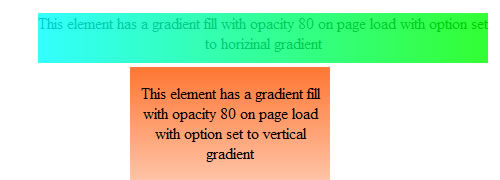
It allows you to define a gradient fill and have an element filled with a gradient. You can set the direction of the gradient (right-left or up-down) and the opacity of the gradient easily.
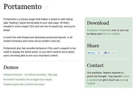 A Simple jQuery Plugin For Flexible Floating Panels With Portamento.js
 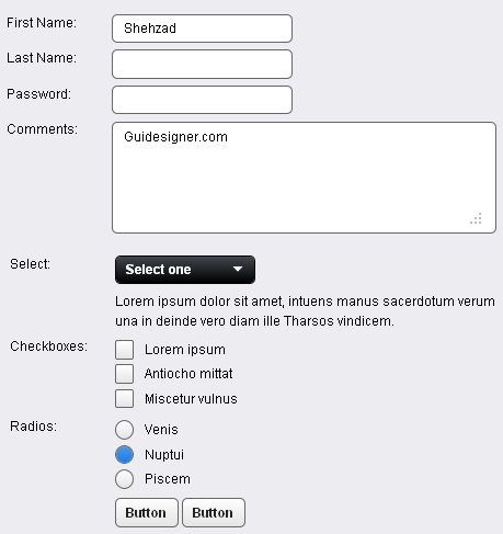 A Light weight, small framework for beautiful forms: Ideal Forms
 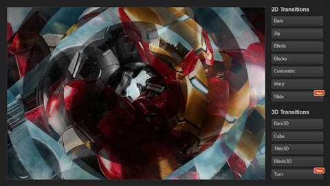 CSS3 Powered jQuery Image Slider for 2D or 3D transitions – Flux Slider
 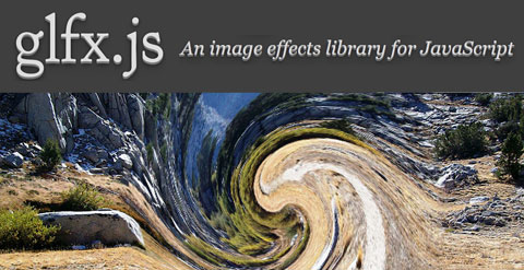 Filter-Rich Java Script Image Effects Library – glfx.js
  How to Start a Functioning Website Under Thirty Dollars 2021?
  The HTML5 Time Element Is Back and Better Than Ever
  Mozilla Introduce Firefox 9, with Speed and less memory improvements
 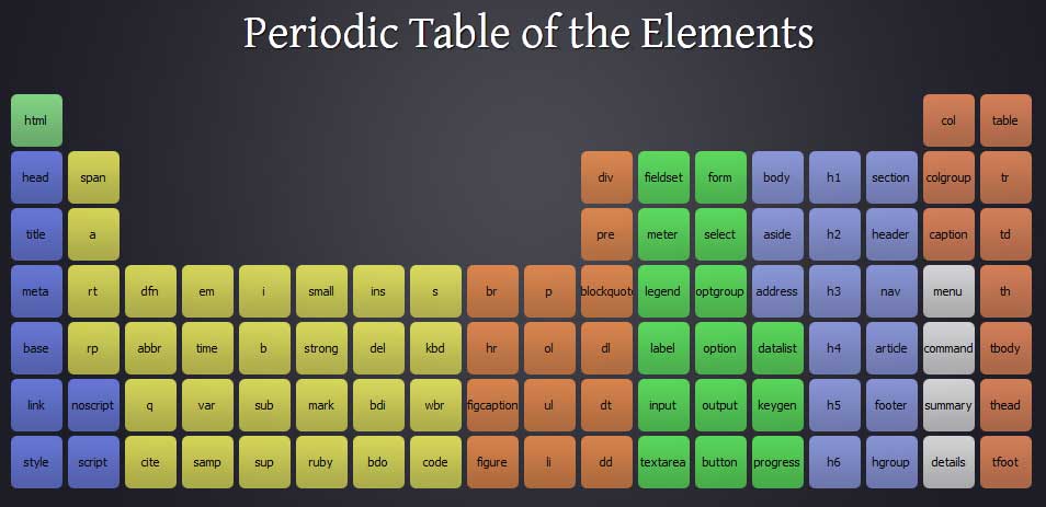 Periodeic table of HTML5 Elements, arrange by type.